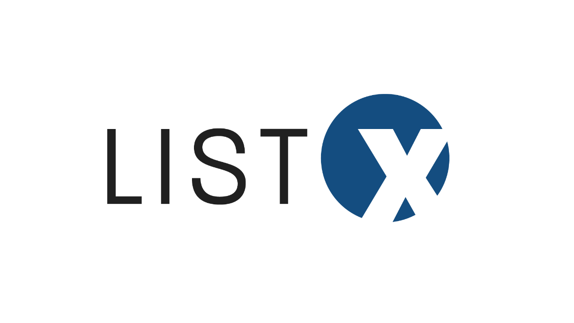
List X
List X is a startup full service media company that focuses on photography, videography, 3D tours and other media resources to help realtors sell homes, lots, apartments or corporate offices. I was tasked with designing a logo and other promotional materials for the company. Here I’ve outlined my process leading up to the final product.
Final Logo
Logo Applications
After really enjoying the logo, I was fortunate to be able to work with them on other design projects for the company.
Business Cards
Social Media Templates
Color Palette
Initial Concepts
Tried to combine too many elements & realized it looked more like an organic trendy food brand than a photography company.
With this new approach I tried to communicate a more corporate feel, but it didn’t adequately emphasize the “X” as suggested by the client.
The final “X” symbol arose out of this iteration. This idea behind the corner shapes was that they would be reminiscent of a camera shutter.
I wanted the name of the company to be clear, so I added the full name to the side as well as “Yancey Media” to hold onto the owner’s previous brand name.
First Deliverable to Client
Client Feedback
Get rid of old brand name “Yancey Media”
Integrate “X” icon into the name of the company
Capitalize entire name of brand
Second Deliverable to Client
After sending a preview of the logo with just the “LIST” and the “X” icon, the client asked me to experiment with a couple of different typefaces. Below is what I sent back to the client. I chose two typefaces that were boxier and had a bit of a personality to fit the design of the “X” and bring a bit of life into an otherwise simple corporate logo.
Figure 1
Client Feedback
Wasn’t convinced of either typeface
Sent back a typeface that they preferred (see figure 1)
Logo Research
When I received this logo with a new typeface, I didn’t think it was a good fit for the logo. To figure out whether I was right or just stuck in my head, I did some quick research to figure out what would be the most appealing to the target audience. Below is what I sent to the client.
Client Feedback
They loved it! (Always good news to hear, haha)


